OLIO
UI/UX App Design
A secondhand shopping brand struggling to keep user retention.
I did a full UI & feature refresh to enhance their sustainable mission.
The Problem
Olio’s interface is too confusing & is easily abandonable. Olio needs an organizational, feature, and branding, refresh to keep users interested and actively using the app.
Goal
To create a more simple, intuitive interface that will appeal to more users & increase the level of attention.
Research
Competitive Analysis
I dived into research with a competitive analysis of Olio’s app to other apps that have similar missions and operate in a similar manner: TooGoodtoGo & ThredUP.

Storyboard
I illustrated how most users will abandon the app before accomplishing their goal by creating a simple storyboard to show a common user dilemma.

Persona
With the bulk of the research established, I created a persona to further empathize with the user.
I created a user that:
I created a user that:
- Prioritizes sustainable
- Greatly values community, but needs convenience

Design
Wireframes
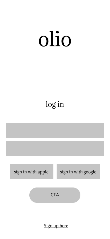
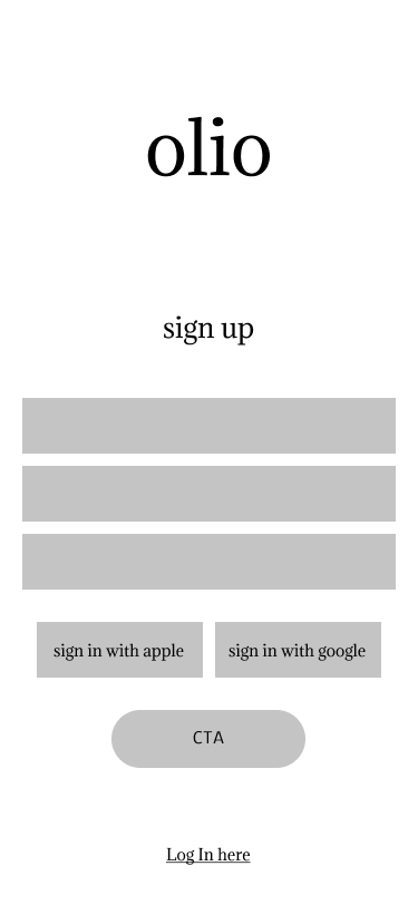
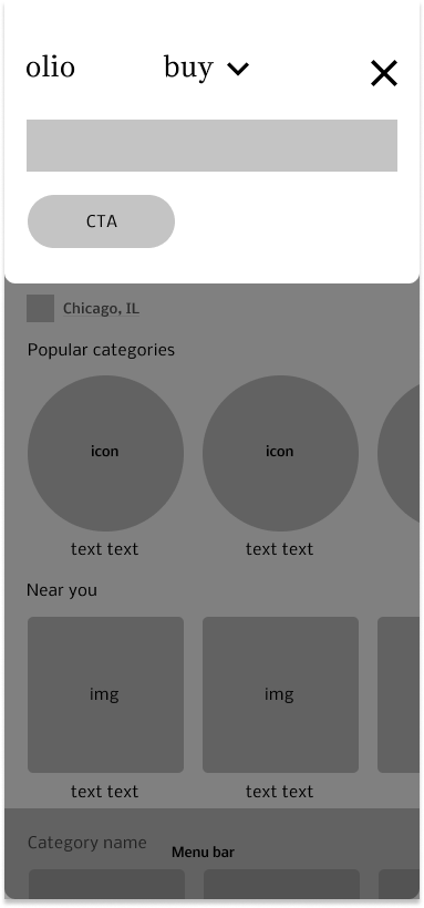
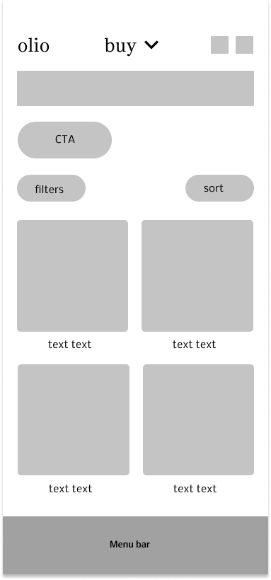
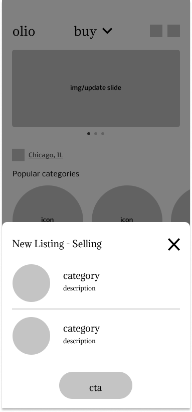
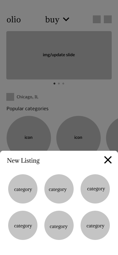
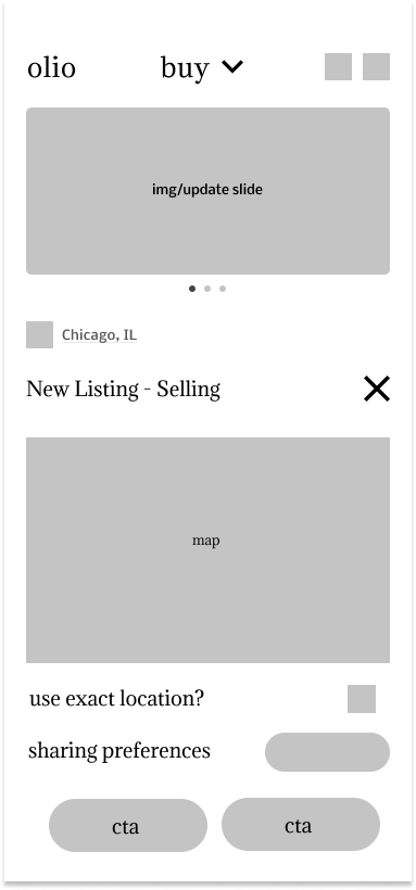
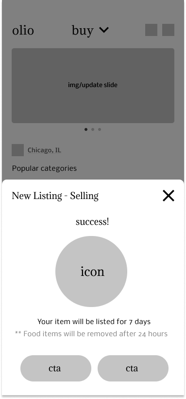
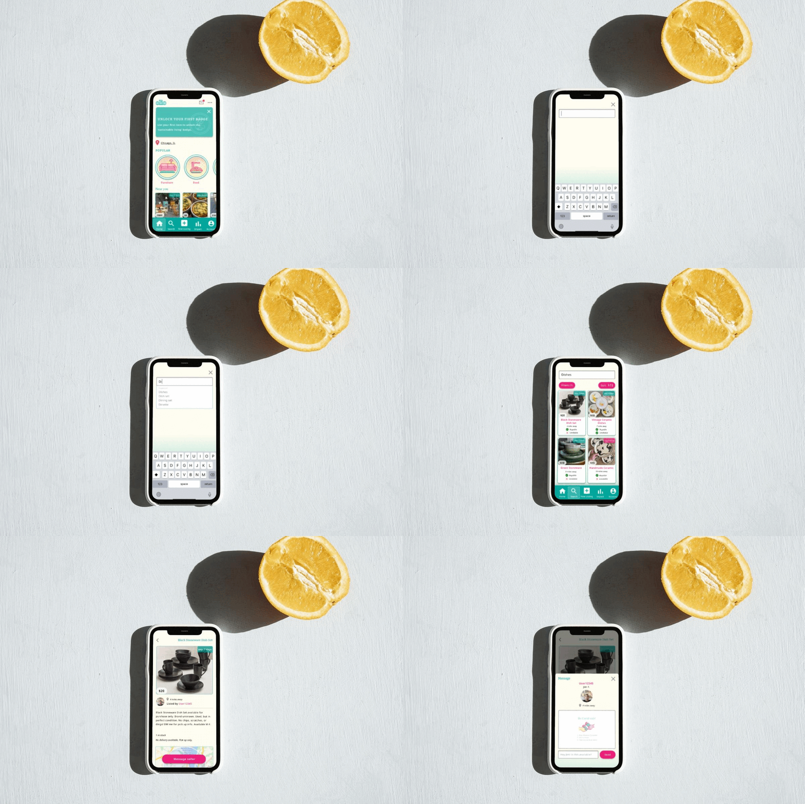
I started the designing process for the new UI refresh.
I stuck with a search flow because it is the most used feature on any secondhand shopping app.
I stuck with a search flow because it is the most used feature on any secondhand shopping app.



Style Tile
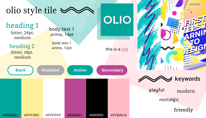
I designed a completely new refreshed visual language using the research findings I have gathered, appealing to a vintage memphis design aesthetic with a 90s vibe, an offset printed feel to it.
Along with the style tile, I created a range of custom icons so that the app would have its own unique feel to it.
New Features
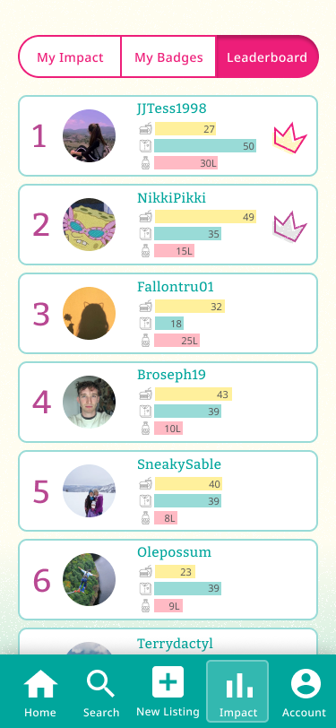
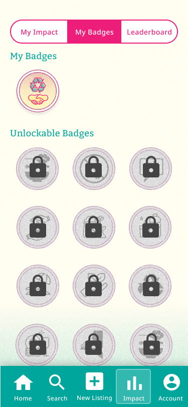
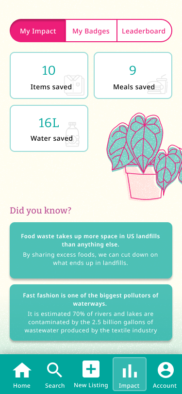
A feature I was most excited to add was the “impact” tab.
I gamified the app and created added a competitive leaderboard, badges, and an impact tracker with sustainability tips.
Specifically, one study found that employees see a 48% increase in engagement with the help of gamification.
I gamified the app and created added a competitive leaderboard, badges, and an impact tracker with sustainability tips.
Specifically, one study found that employees see a 48% increase in engagement with the help of gamification.
Prototype & Testing
Testing
For the testing, I recruited four colleagues who I have known to shop secondhand for most of their shopping. I was testing through a more open discussion format to mostly record their thoughts.The plan was to first test the users on the prototype, ask a series of questions, then show the original Olio app and record their thoughts & impressions.
Key Takeaways
Although all users were able to understand the concept behind both apps, the original Olio app took a 60 seconds longer for people to understand and familiarize themselves with.All users observed that:
- Olio’s concept does increase the likelihood to share items communally.
- Sustainability was viewed as a “bonus” or “feel-good” aspect.
- They enjoyed the forums aspect of the original app, but did not like the idea of having another social media related app.
Next Steps
After hearing the user’s feedback, I decided my next round of improvements would include:
- More sustainability goals.
- ‘Similar items’ feature on the search results page.
- Overall UI improvements to motivate usability & clickability.
How can I make sustainability a priority experience?
What features can I bring to the app to improve this flow for the user?
How much influence would the “impact” feature have on day-to-day sustainable living?
Take a look at the before & after slider below to compare the original landing page to the redesign.︎︎︎
