01 OLIO
olioex.com
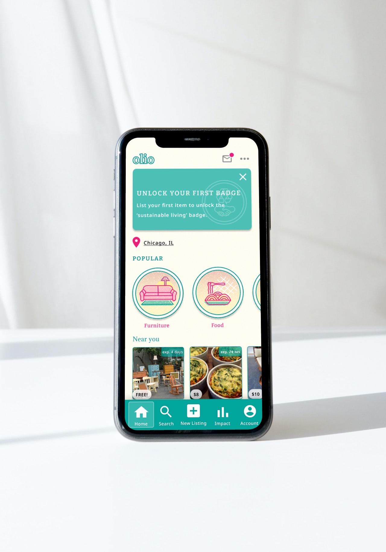
Intro //
background
Olio is an app that is meant to help neighbors connect communally and reduce food waste through a digital localized marketplace.
the problem
Olio’s interface is too confusing & is easily abandonable. It takes a user longer to figure out how to use the app than to list an unwanted item. Olio needs an organizational, as well a branding, refresh to keep users interested and actively using the app.
Project Goal //
To create a more simple, intuitive interface that will appeal to more users & increase the level of attention.
Research //
competitive analysis
To kick off my redesign, I had to deep dive into some empathy research to understand the potential user’s issues.
I started by comparing Olio’s current interface to other apps that have similar missions and operate in a similar manner (TooGoodtoGo, ThredUP).
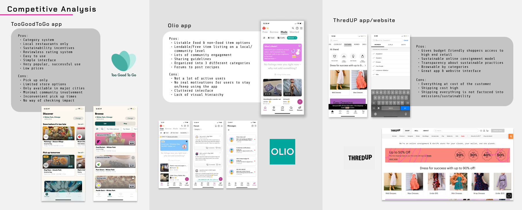
Read the entire summary here.
my impression
With the competitive analysis done, I figure I would use my intuition & analyzation skills to detail my thoughts & impressions of Olio’s interface.
The goals feature shows that the app is dedicated towards their message of living sustainably, there’s no true motivator to keep up with the goals.
storyboard
Next I wanted to illustrate how most users will abandon the app before accomplishing their goal, so I created a simple storyboard to show the user’s issue.

persona
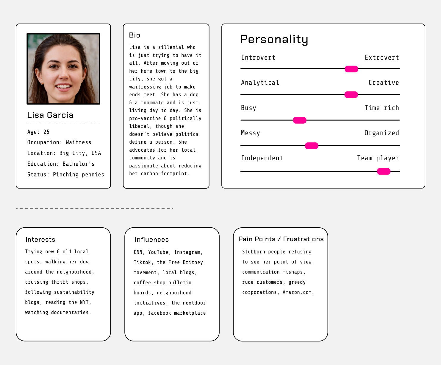
With the bulk of the research established, I created a persona to further put myself into the user’s perspective.
I created a persona based off of my colleagues & peers: a user that prioritizes green living, sees great value in community, and is always on the move.
Design //
structure
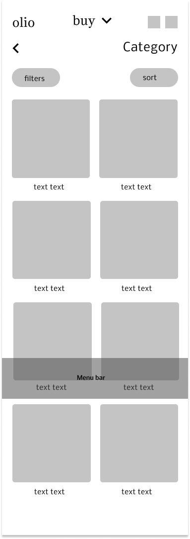
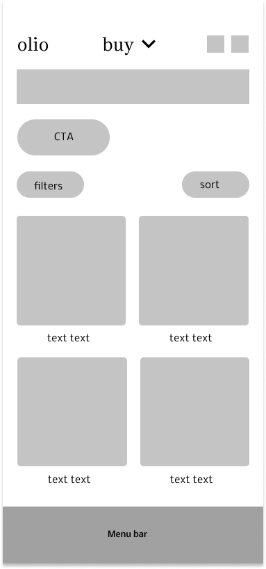
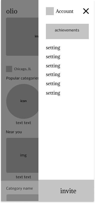
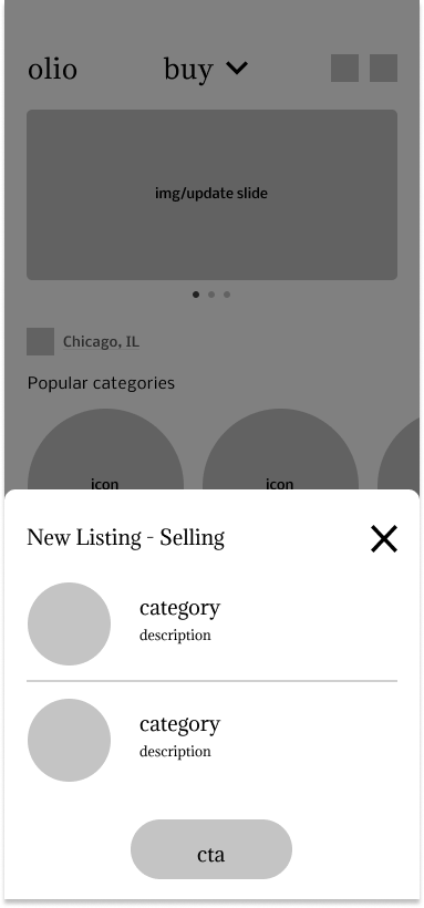
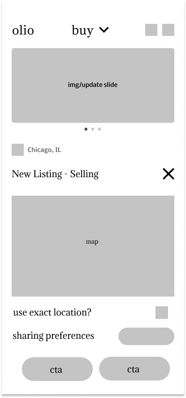
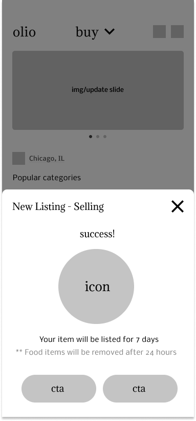
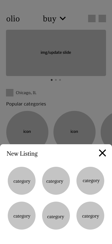
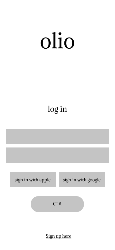
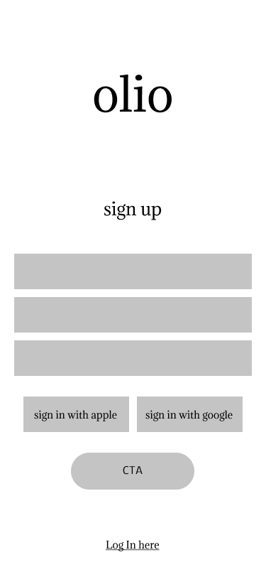
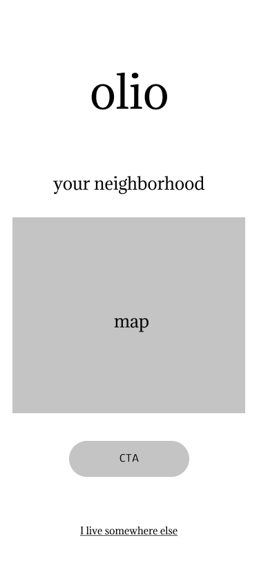
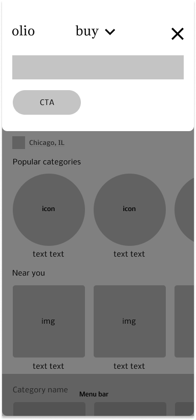
With the research secured, I used wireframing to highlight some of the key screens the Olio app highlights. From there I was able to start the designing process and decided to stick with a browsing/searching flow since my research had shown that most people use these marketplace apps to search for items.

style tile
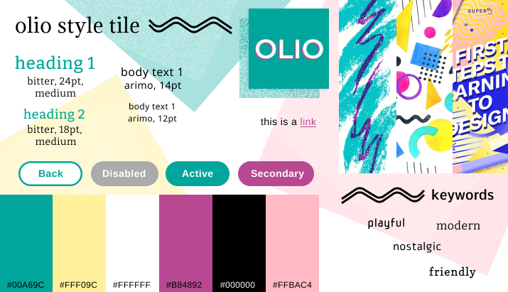
To further flesh out the app, I designed a visual language based on my persona of a modern thrifter appealing to a memphis design aesthetic with a 90s feel within the same color language. I wanted the colors to look imperfect & somewhat grainy so it would have an offset printed feel to it.
Along with the style tile, I created a range of custom icons so that the app would have its own unique feel to it.
prototyping
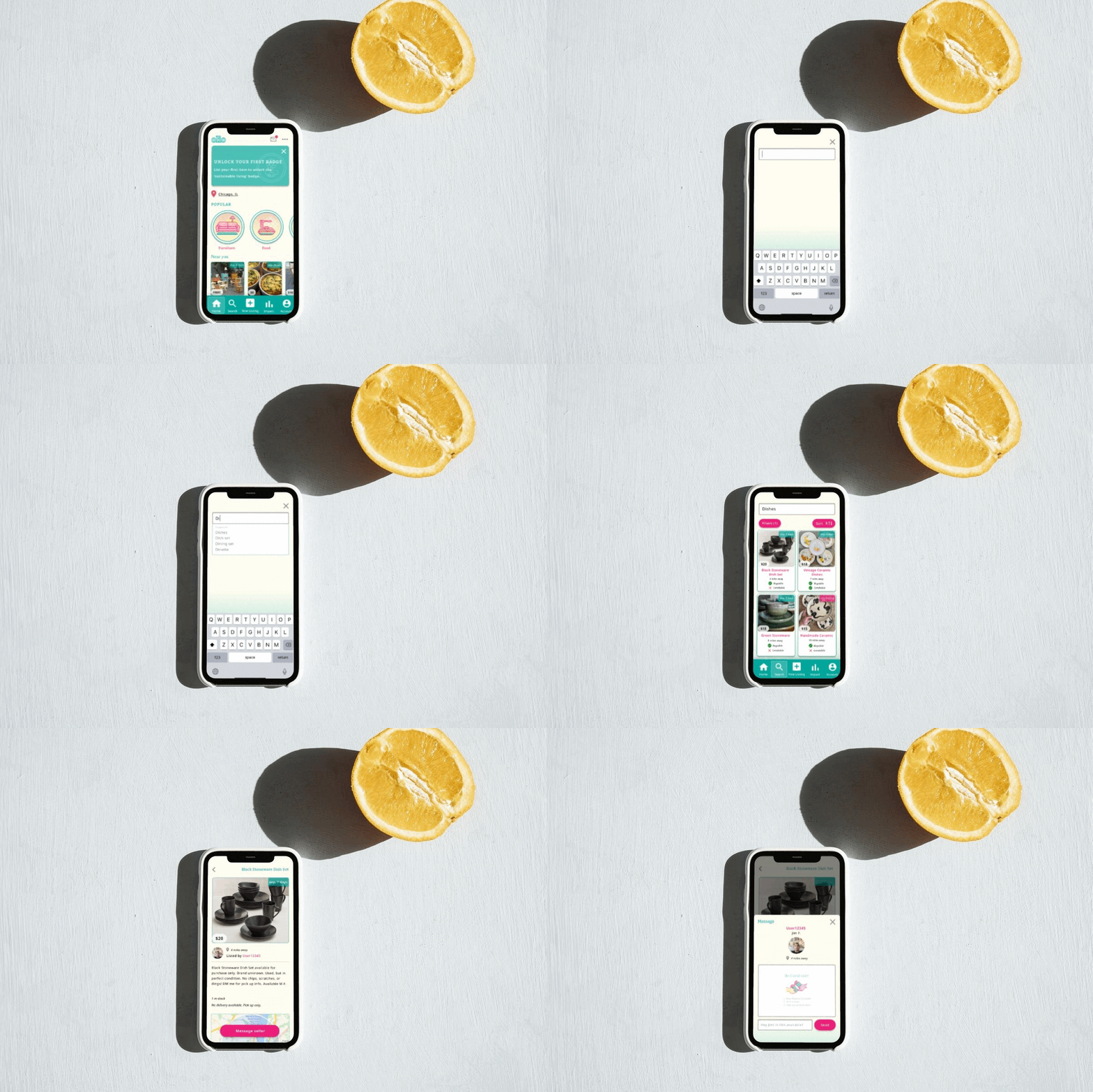
With the bulk of the design work done, I started to create a prototype for usability testing. I tested out a ‘searching’ flow since my research observed that most secondhand shopping is conducted with the intention of finding or browsing for a product the user needs. I did also create a “impact” menu option for added motivation.
A feature I was excited to add to my design was the “Impact” tab on the bottom navigation. This added a leaderboard, badges (using my custom iconography), and an impact tracker with sustainability tips.
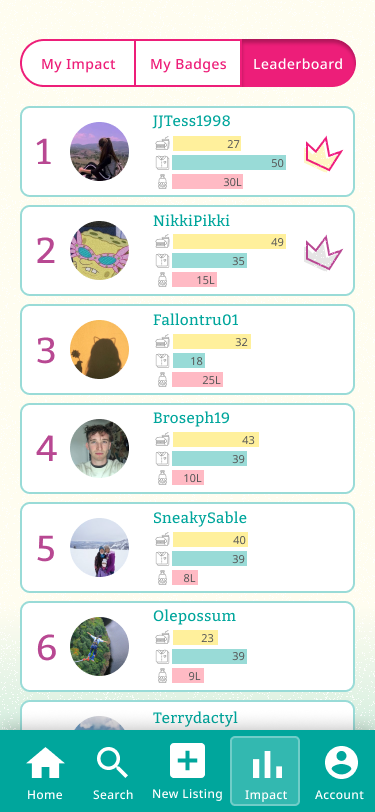
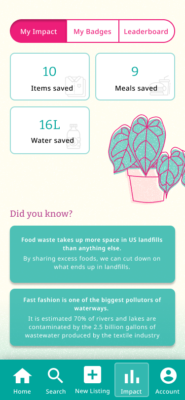
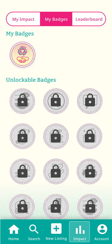
With all of the designs, flows, & features fleshed out, I created the prototype below to test my users with.
Usability //
recruiting & testing
For the testing, I recruited four colleagues who I have known to shop secondhand for most of their shopping. I was testing through a more open discussion format to mostly record their thoughts.
The plan was to first test the users on the prototype, ask a series of questions, then show the original Olio app and record their thoughts & impressions.
key takeaways
- Although all users were able to understand that both of these apps would be used for the same intentions, the original Olio app took a full minute longer for people to understand and familiarize themselves with.
- All users stated that being aware of an app with Olio’s concept does enhance a belief in their ability to share items communally.
- All users suggested a ‘similar items’ feature for the results page.
- Sustainability was viewed as a “bonus” or “feel-good” aspect in both of the apps and was not necessarily a motivator for everyone.
- The leaderboard feature was viewed as a motivator to use the app more frequently.
- All users enjoyed the forums aspect of the original app, but did not like the concept of having another social media related app.
Next Steps //
improvements
After hearing the user’s feedback, I decided my next round of improvements would include:
- More sustainability goals.
- ‘Similar items’ feature on the search results page.
- Overall UI improvements to motivate usability & clickability.
reflection
Upon reflecting on my redesign of this app, I reflected on my research:
- How can I make sustainability more prominent in the app experience?
- What features can I implement to improve this flow for the user?
- How much influence would the “impact” feature have on day-to-day sustainable living?
- How do I motivate the user to share more communally without creating another social media based app?
Take a look at the before & after slider below to compare the original landing page to the redesign.
HOME | NEXT︎︎︎