02 CHICAGO FILM SOCIETY

Intro //
Background
The Chicago Film Society has been working hard to preserve & restore film to its former glory since 2011. I have been a long time fan of their work and supporting them through attending film festivals, I reached out to see if there was any way I could help better organize & improve their user experience design.
I reached out and offered my services through their website.
Becca Hall, one of the co-founders & web managers of CFS, got back to me with a laundry list of issues she was currently tackling with their current site.
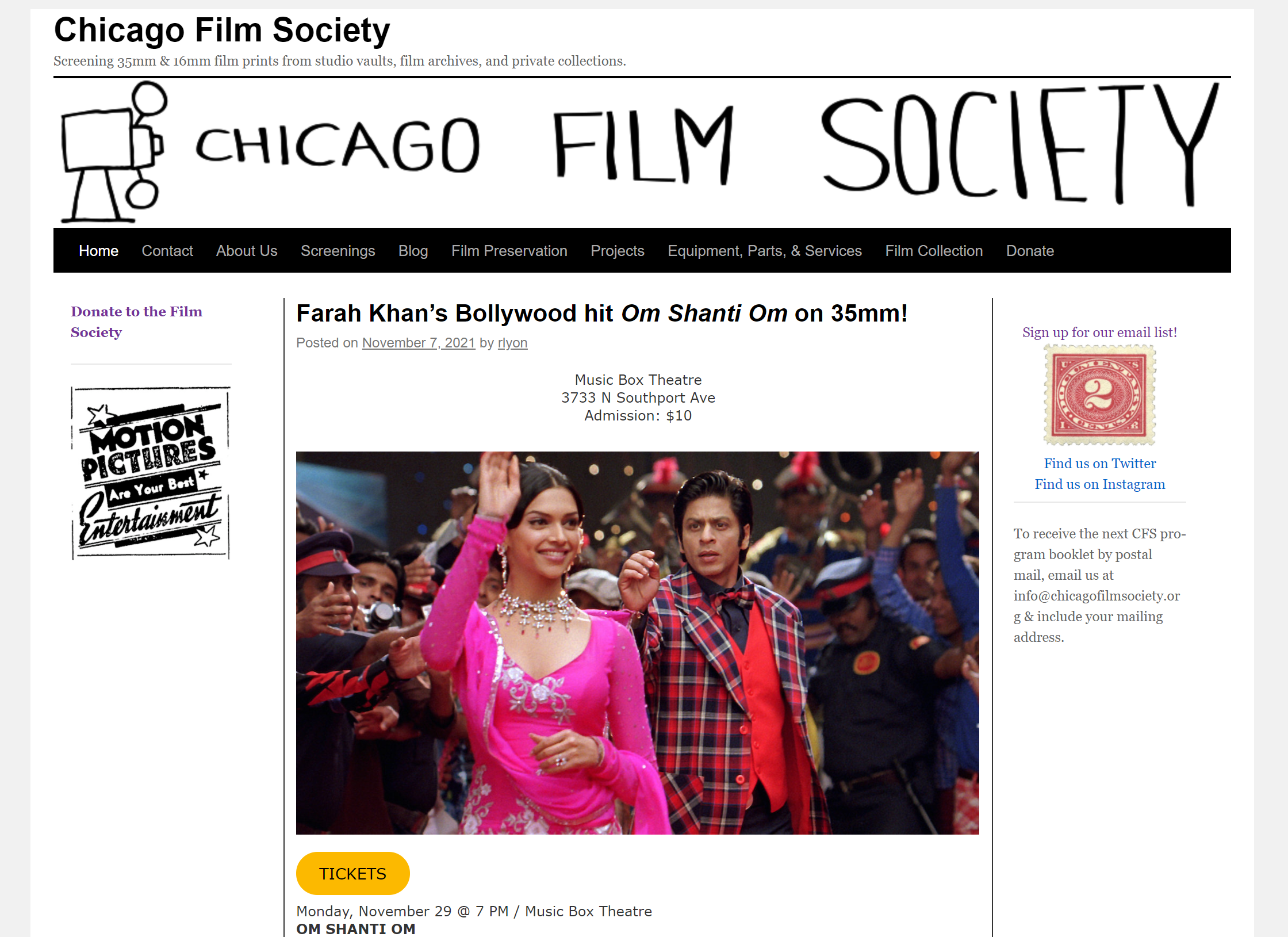
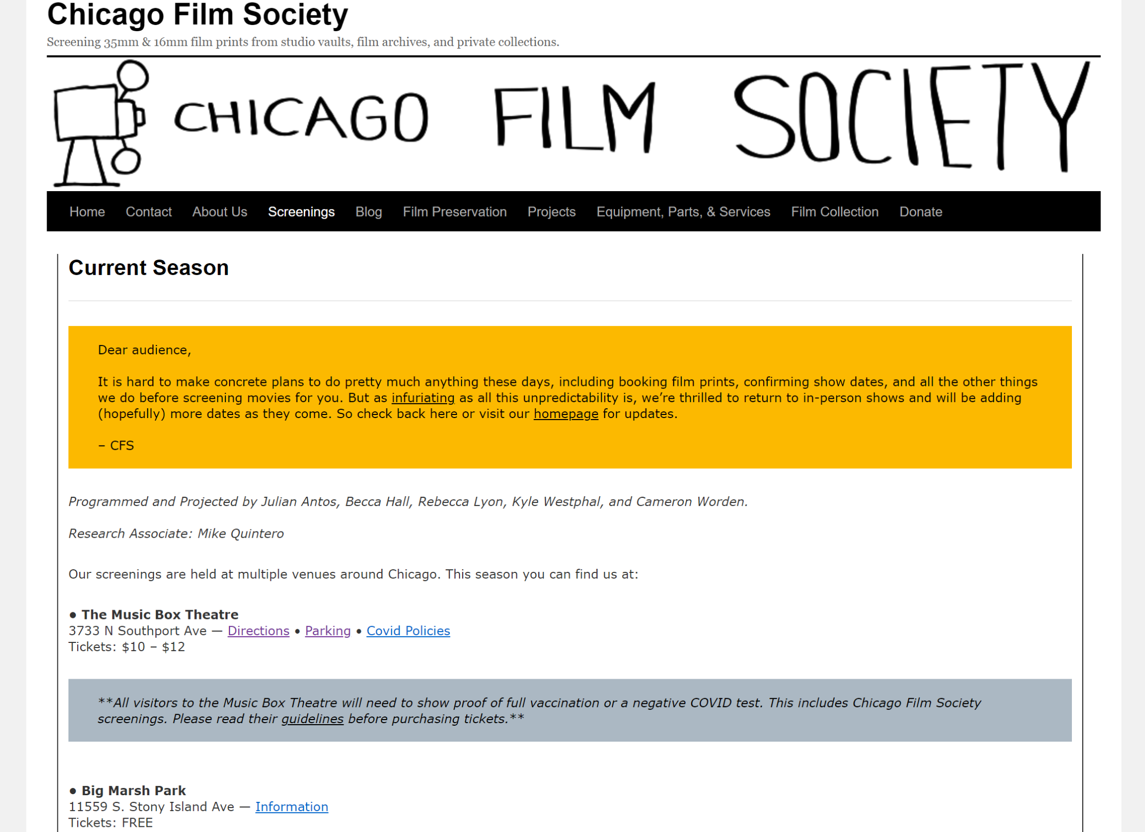
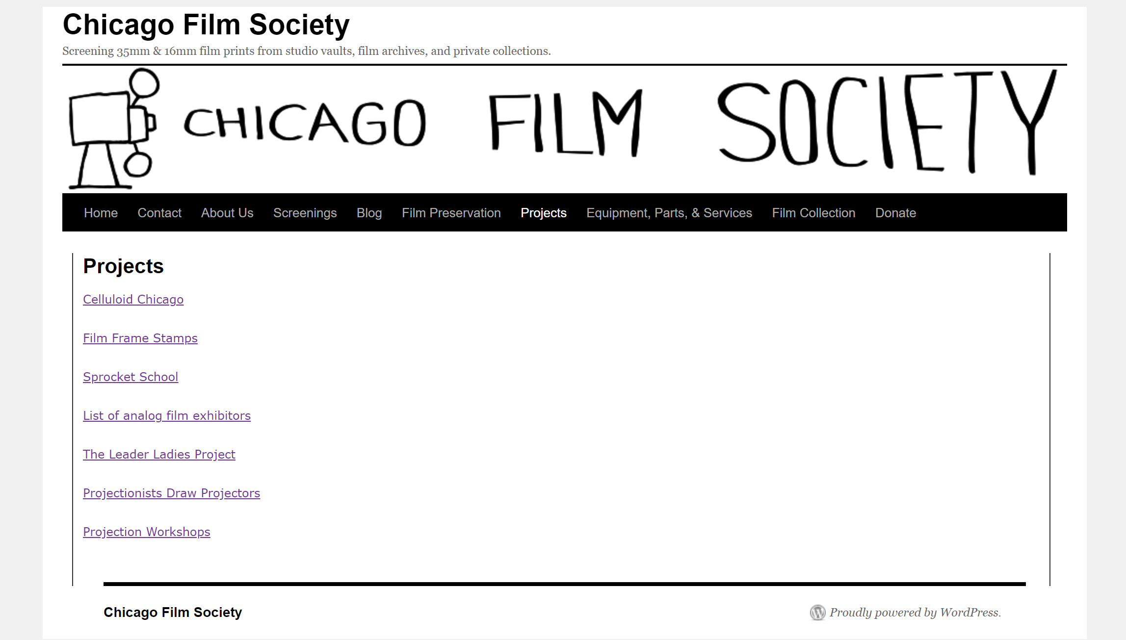
Below are examples of how the website looked when I had reached out to Becca.
The Problem
The Chicago Film Society hasn’t updated their interface in a long time and every time they added a new page, they just add the page to the main menu. It’s clear that this issue has been cluttering up their interface and making their website confusing to navigate.
I asked Becca about their interface, she told me that they would love to change their current layout. I took the opportunity to completely redesign their interface.
Project Goal //
A complete makeover of the interface & reorganization of the information architecture.
Research //
User Interviews
After establishing my goals for this project, I interviewed three people who offered different perspectives relating to the nonprofit industry and film culture.
All agreed that the interface was cluttered and that there needs to be a definite change to their menu. The pages were generally confusing and one frequent user was incredibly surprised to learn about some of their other features.
With the users confirming my initial suspicions, I was able to move forward.
Competitive Analysis
Becca had sent me wonderful examples of other organizations with similar audiences that had very simplistic websites. I studied their interfaces & menu organization in order to understand what other websites with similar audiences are doing well & not as well.
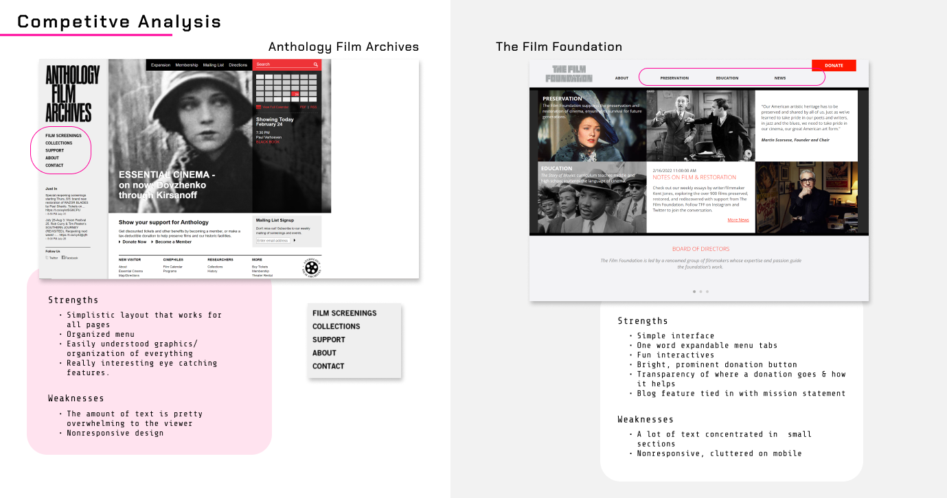
Read the full competitive analysis here.
Through this research, I realized that every website I went on for a comparison had simple one-word navigation that contained more options that were expandable/hoverable. They also had generally above the fold layouts that kept the user’s view all in one section, typically just slideshows or side-scroll splash images. This gave me an ample amount of design & organizational information.
User & Task Flows
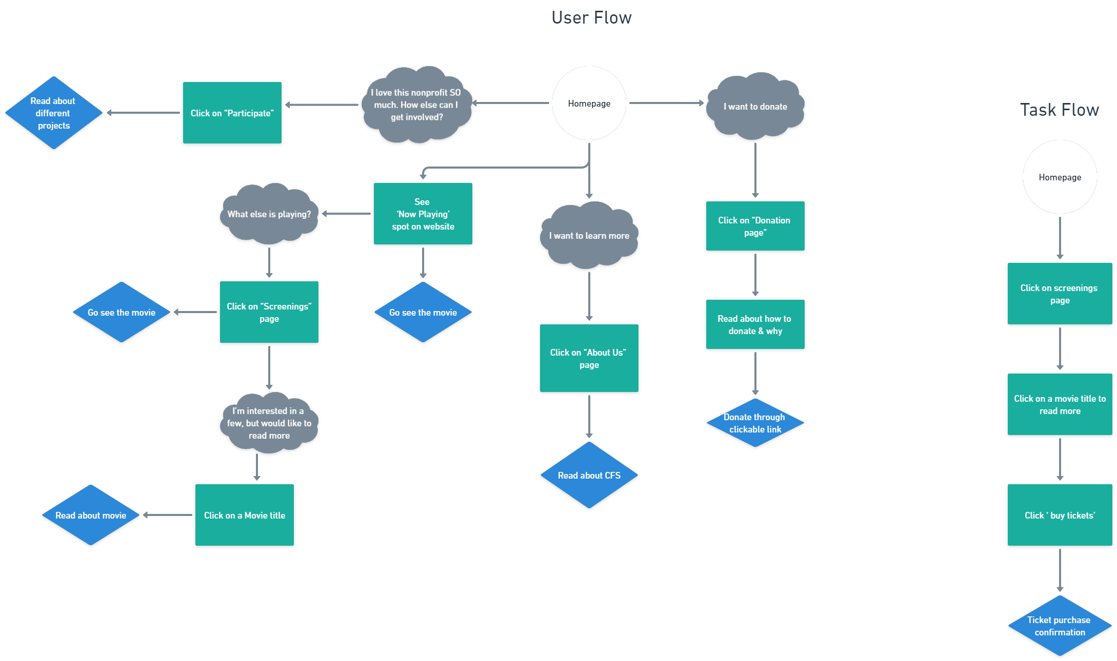
Last step of my research was to envision a common user flow through the website to document the user’s experience. I wanted to simplify the current user’s experience by visualizing how the user walk through a more organized & idealized design.
Closed Card Sorting
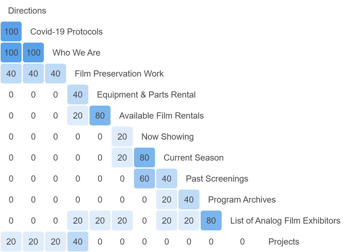
My first challenge was to tackle their information architecture, so I conducted a closed card sorting activity with 5 users who were self-proclaimed movie lovers.
I created 5 categories for users to sort pages into.
Categories:
- About Us
- Collections
- Participate
- Screenings
- Services
The results confirmed my first instinct on how the sorting should be done and verified my suspicions of how the site menu should be sorted.
Site Map
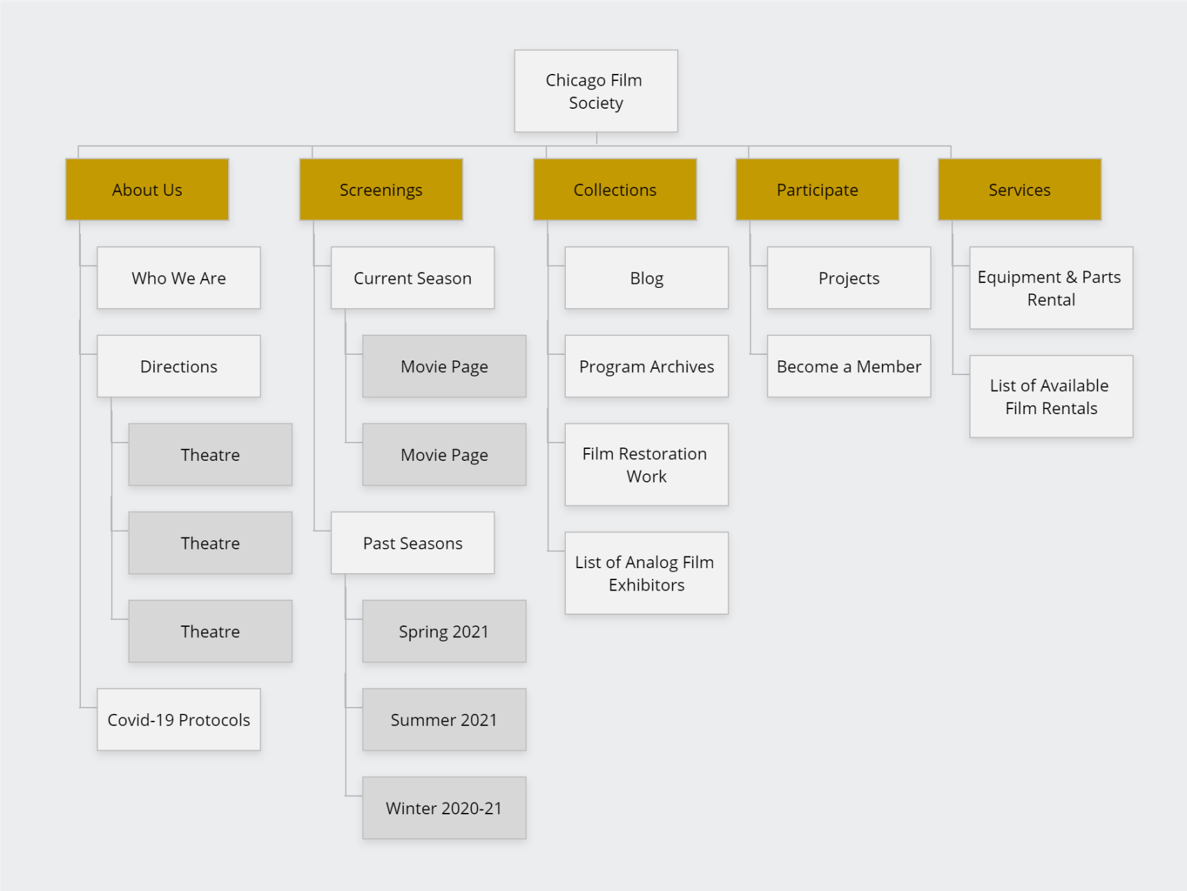
After understanding how the user would logically organize the navigation, I was able to create a site map based off of the user’s optimal preference to cut down on the existing confusion.
Design //
Sketches
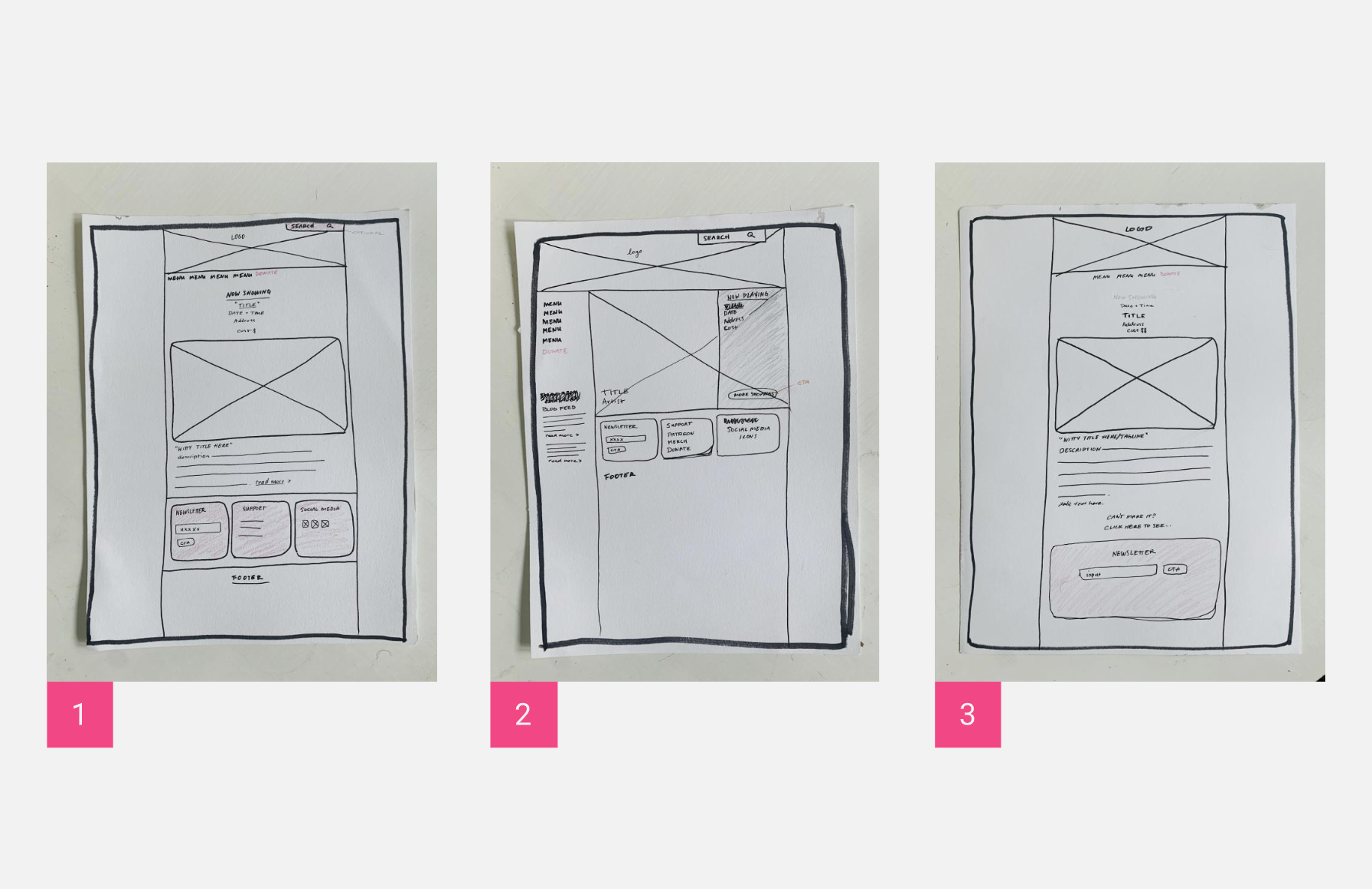
With the research done and ready to be implemented, I created a few sketches based off of the websites that Becca had sent me that I used for the competitive analysis. After hearing a bit of feedback on my sketches from a fellow designer, I settled on design #2 because it felt it would best support the contents of the website & it was easily implementable.
Style Tile
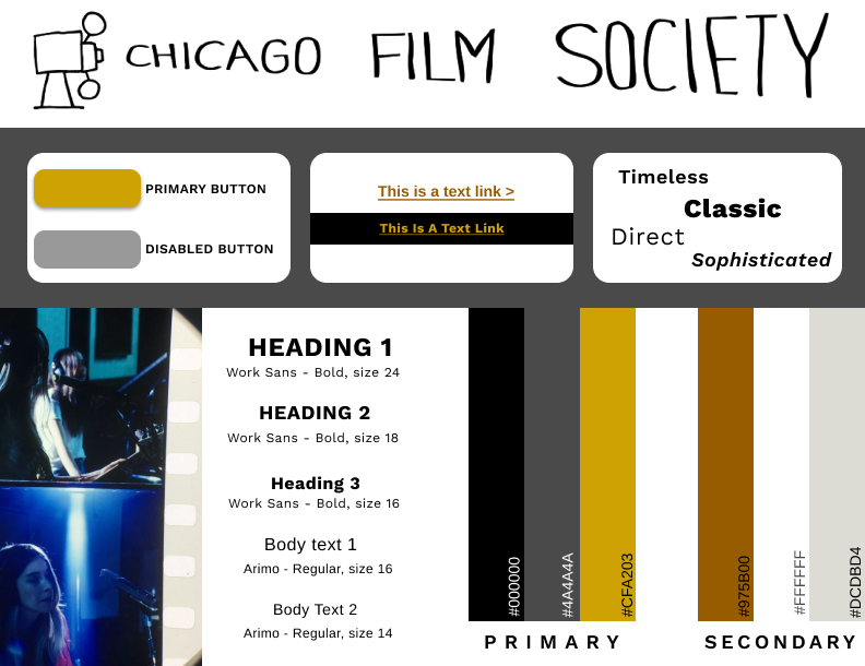
After sketching, I needed to build a visual language in order to create fresh branding for them. They currently didn’t have any guidance with colors & fonts, so I created a style tile so that the website would feel more cohesive and reflects the branding of the Chicago Film Society.
Wireframes
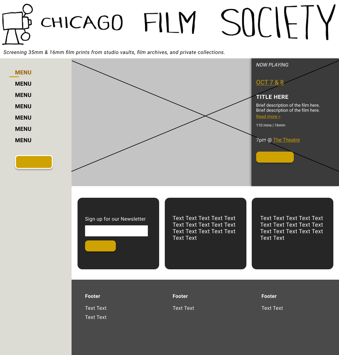
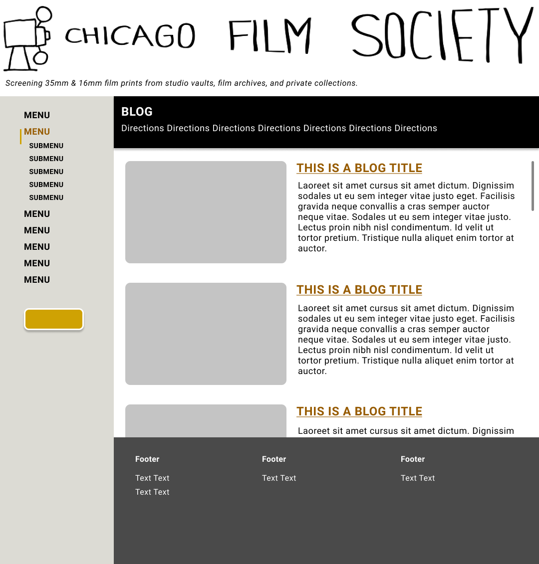
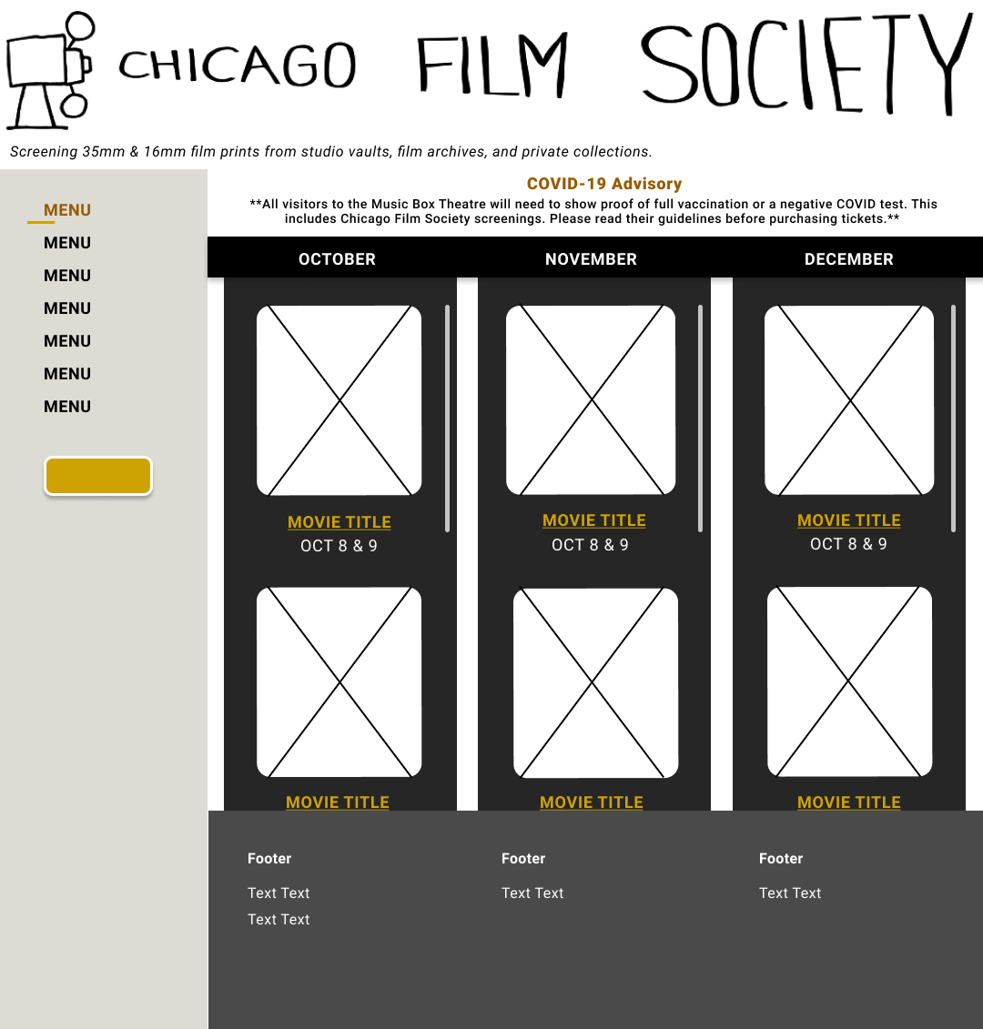
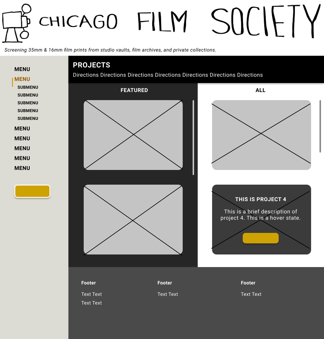
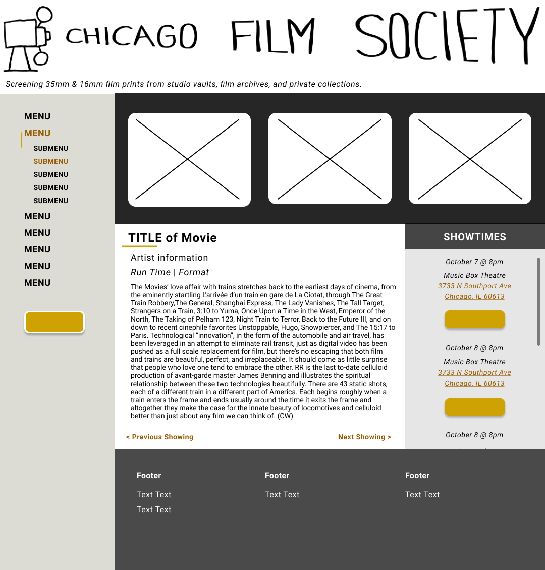
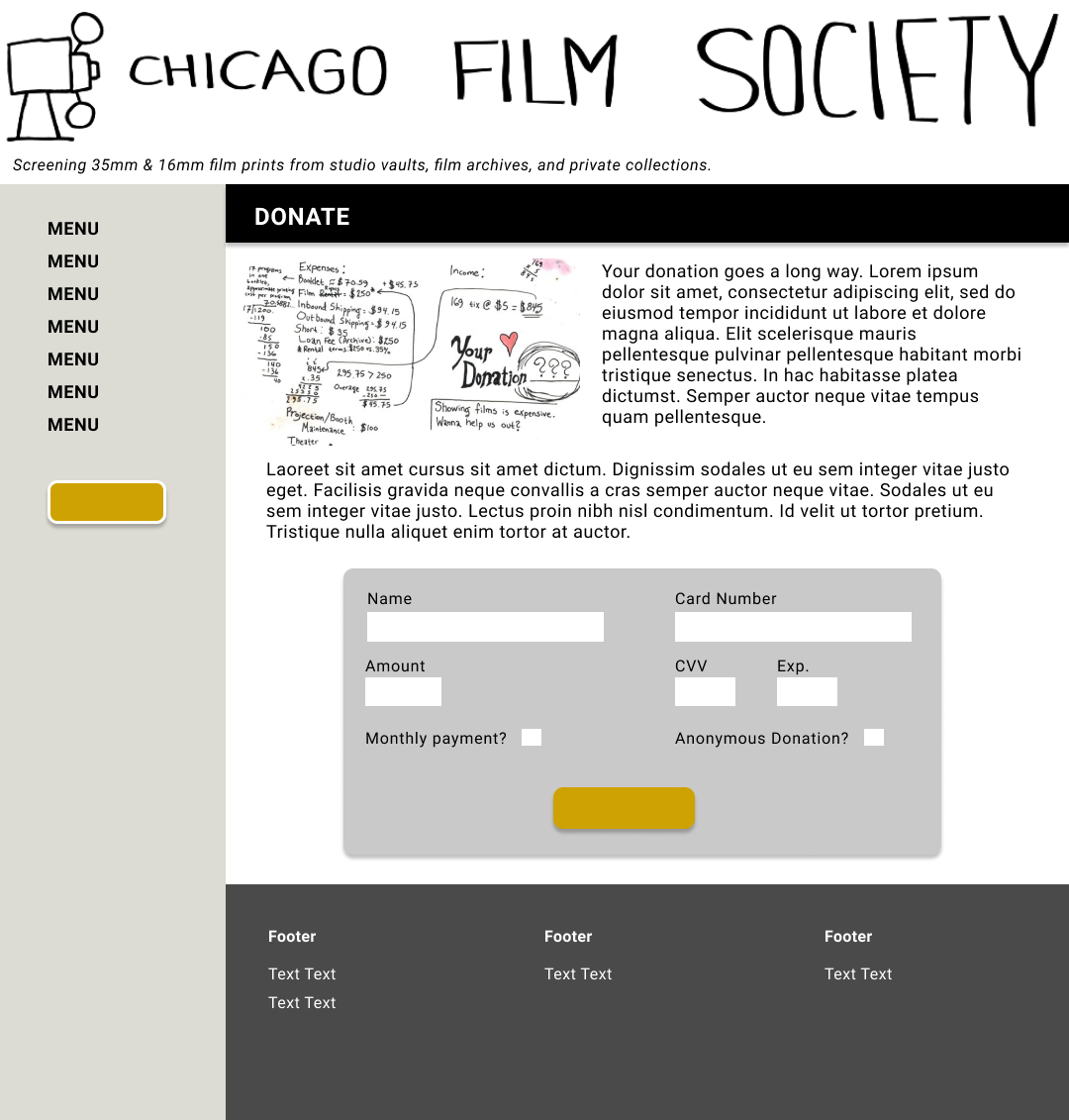
Once the branding was established, I created wireframes in order for Becca & her team to visualize the branding in action. I was inspired by a simplistic, subtle reference the design of film strips.
Becca had no direct dream design for their site, but had priotized the use of her logo since it had been with them since the beginnning.
Drawing from my competitive analysis of the other websites she had sent my way was important to keep in mind as well. Seeing other websites with similar audiences successfully navigate this much information was definitely a way for me to navigate designing this site.
Usability //
Testing
Since the main issue with the CFS website was their general design & information architecture, I wanted to see if user’s would be able to intuitively navigate through the website.
I sent out a card sorting validation activity to 6 users.
Overall the users had an agreement rate of 83% & higher with 9 out of 13 pages under the various categories.
The data confirmed that the information architecture is organized correctly and would be an improvement in their overall site.
Usability
After retesting the IA through closed card sorting, I decided to test to affirm that the design was a definite improvement and actually identifiable and memorable with a 20 second memory test using maze.co to conduct testing.
Key takeaways:
- There was a 100% agreement rate when it came to understanding the main menu & understanding the concept of the website.
- There was a 75% agreement rate in terms of ease of use and generally liking the design.
- All users understood immediately what the website would be used for and commented positively on the ‘Now Playing’ aspect of the homepage.
The results verified that the redesign visually achieves understanding and succeeds in terms of concept & navigability.
Next Steps //
Improvements
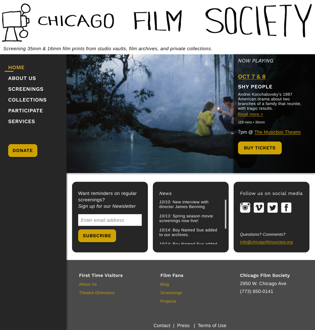
Taking some of the feedback I received from running my usability tests, I made some changes to my design to make it stand out a bit more. I tweaked some of UI so the design would look a bit more modern & cohesive. I added more shadows & gave the layout a darker color scheme to add to a “dark theatre” vibe. I think overall it was a much better visual improvement.


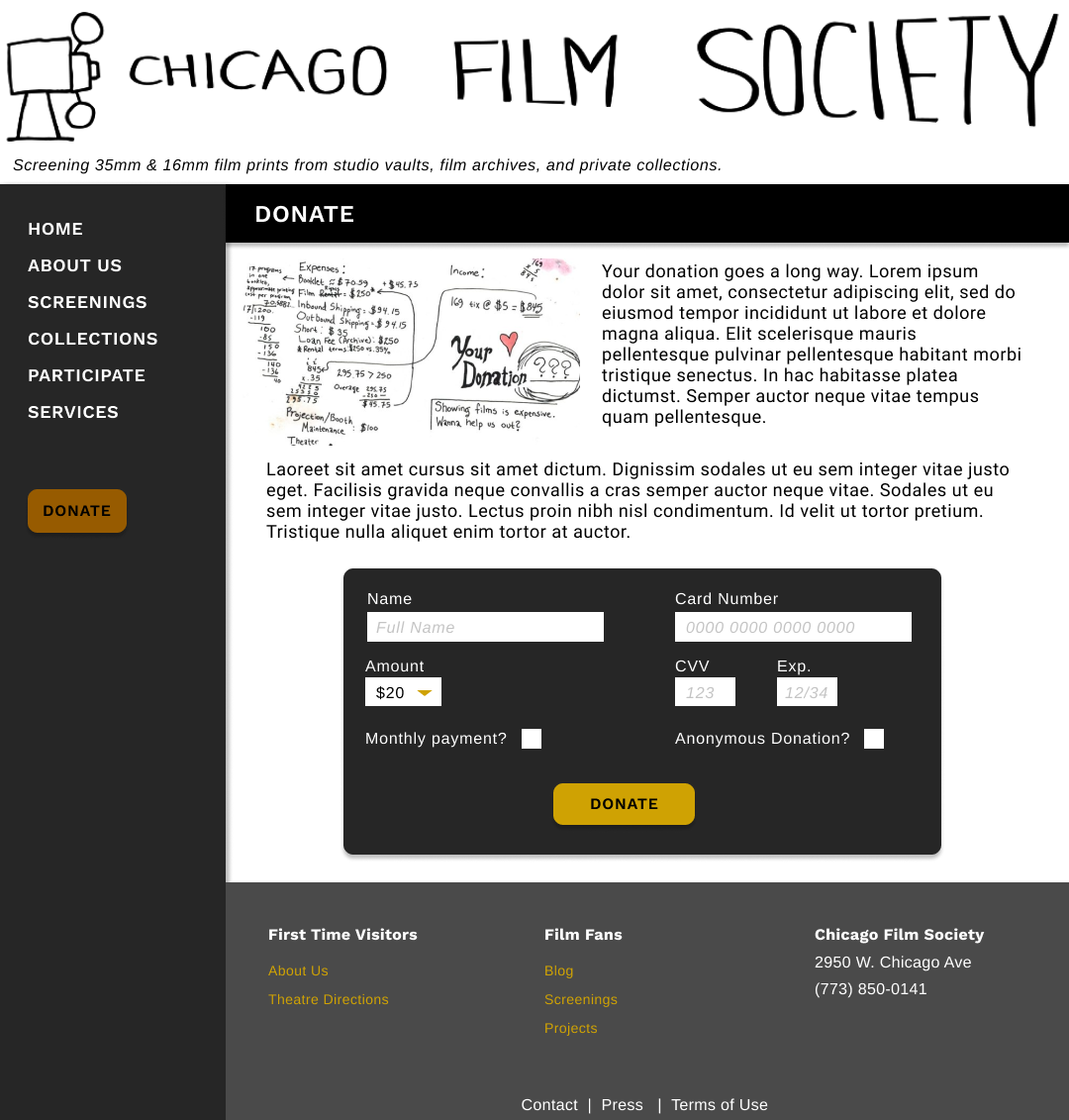
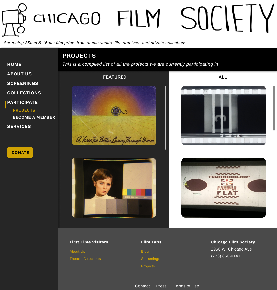

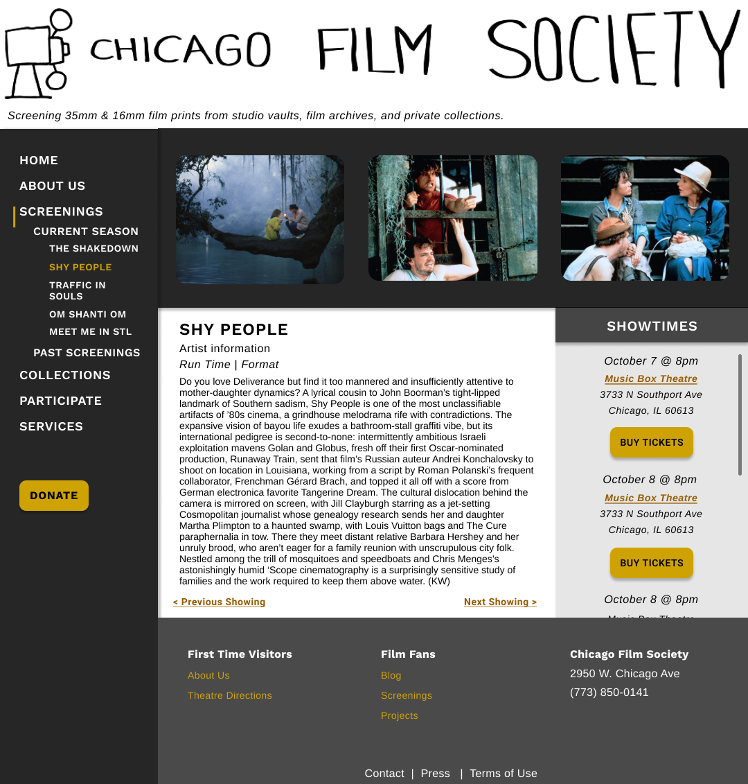
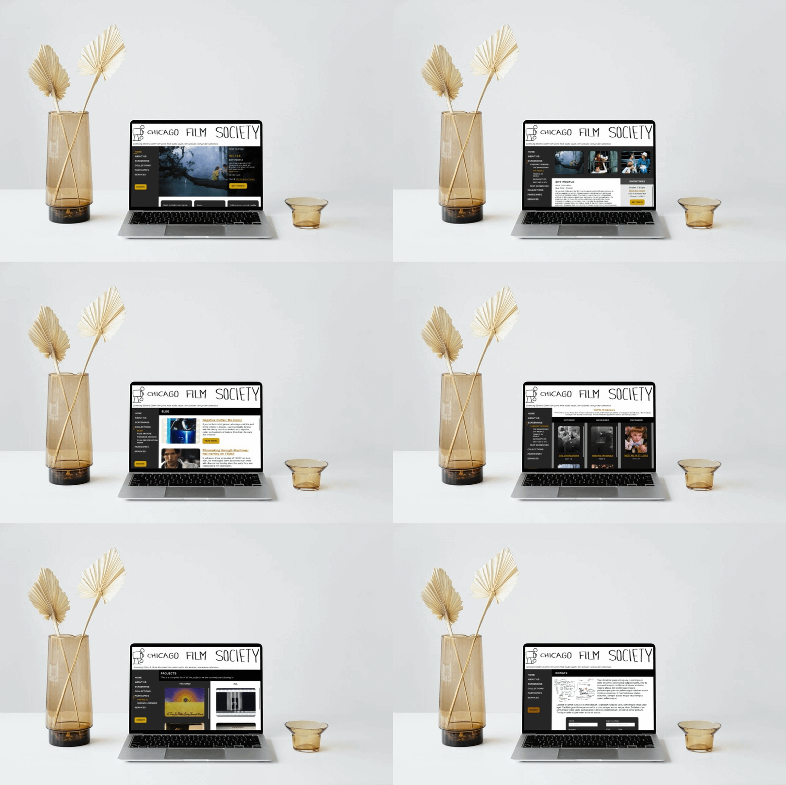
View the full Figma file here.
︎︎︎PREVIOUS | HOME | NEXT︎︎︎